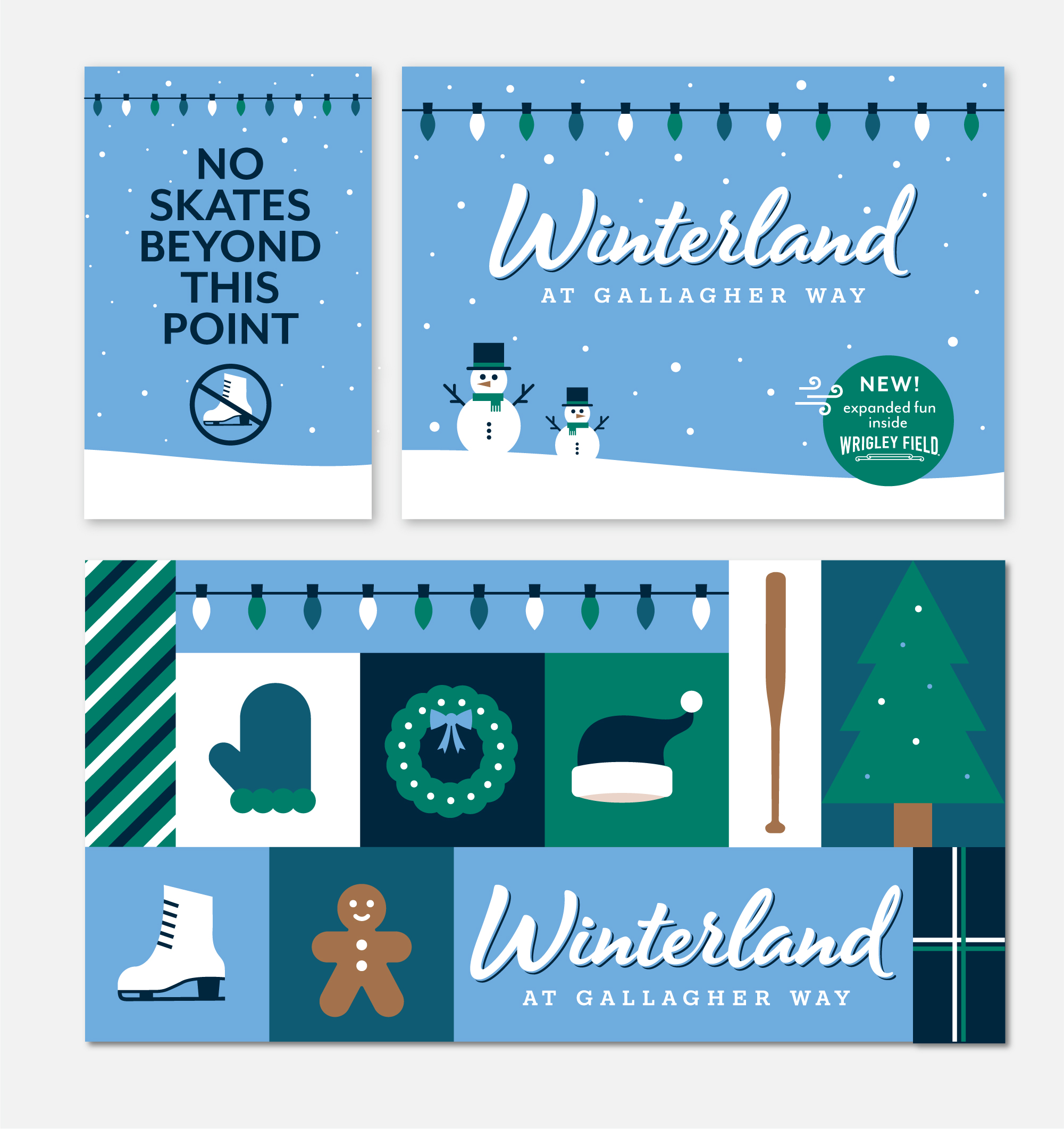
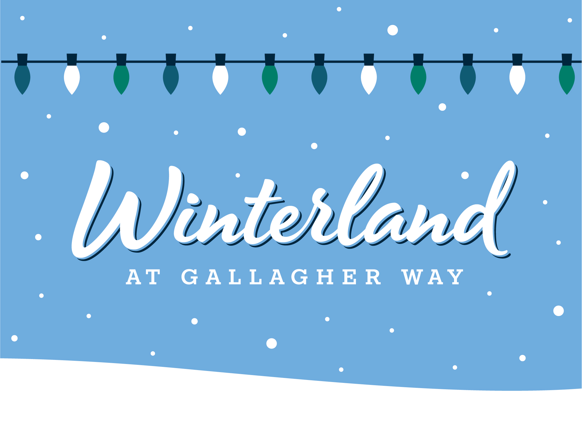
Winterland Branding
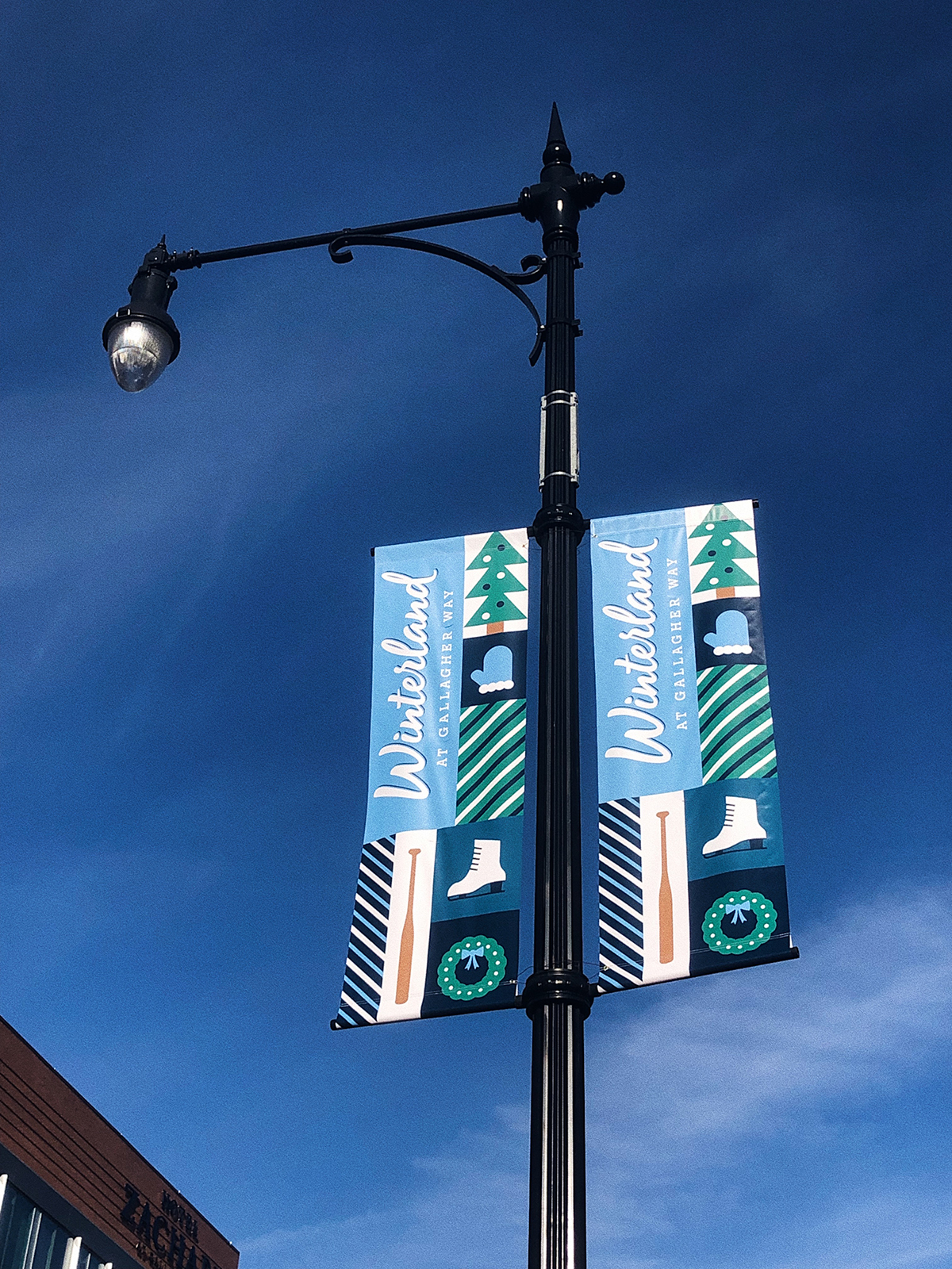
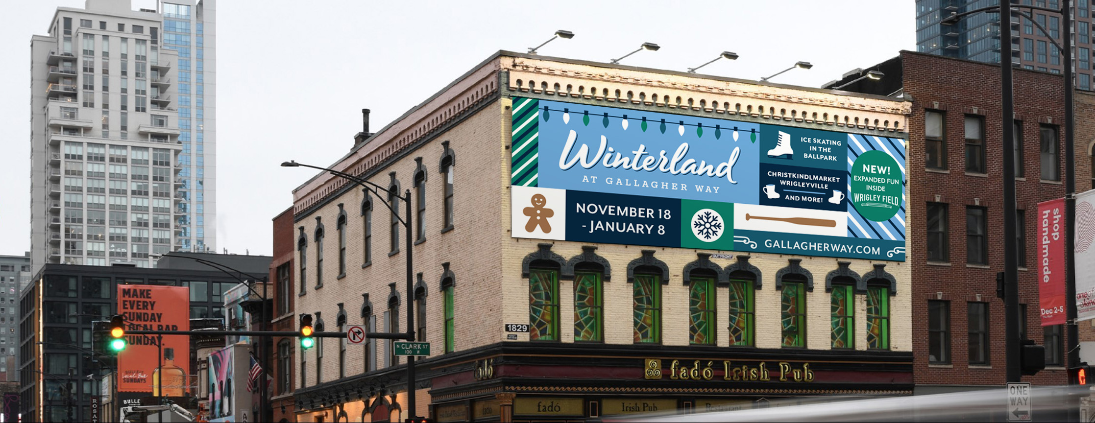
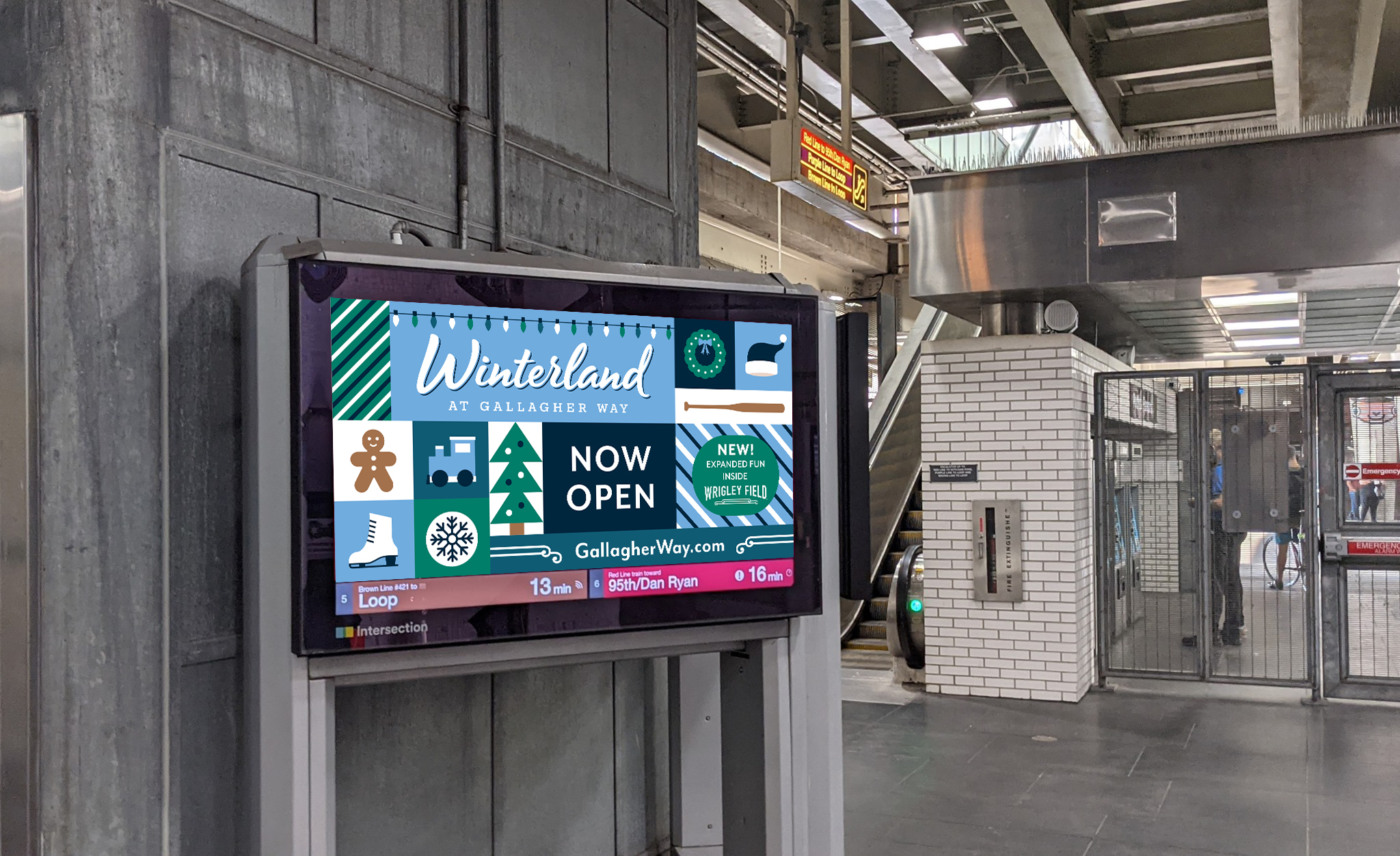
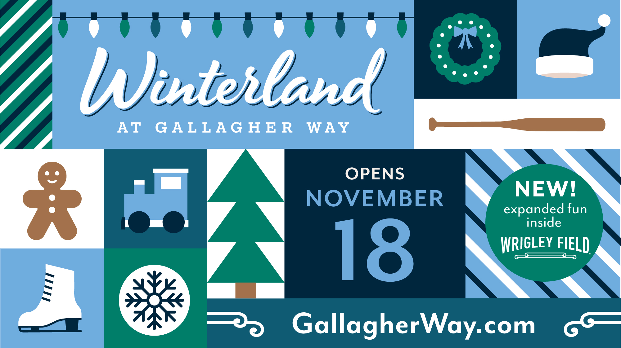
In 2022, Winterland expanded into Wrigley Field for the first time, which called for another brand refresh of the Winterland creative. I revamped the color palette to incorporate a version of ‘Wrigley Field green’ and refreshed the overall color palette to feel more refined with a bit of vintage flair to further reflect the expansion into historic and iconic Wrigley Field. I also refreshed all of the iconography to feel more modern and also added in some whimsical holiday-like patterns to the mix. Below is an overview of the updated branding, which I again had the opportunity to lead and art direct.
Color Palette

Fonts

Iconography

Examples