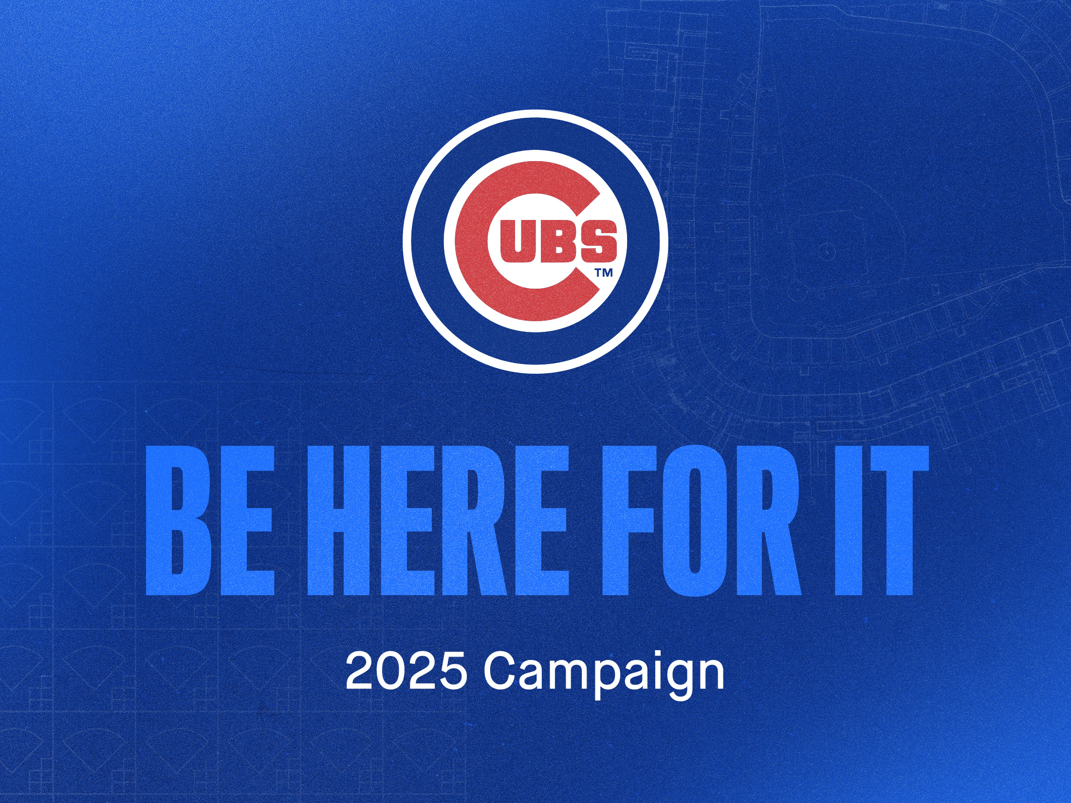
Chicago Cubs 2025 Brand Campaign
In 2025, I played a key role in the development and execution of the Chicago Cubs 2025 Brand Campaign “Be Here For It”. As Senior Graphic Designer, I led the exploration and creative development of the look and feel of the campaign, including font and color selection and the creation of background patterns and other graphic treatments to define the look.
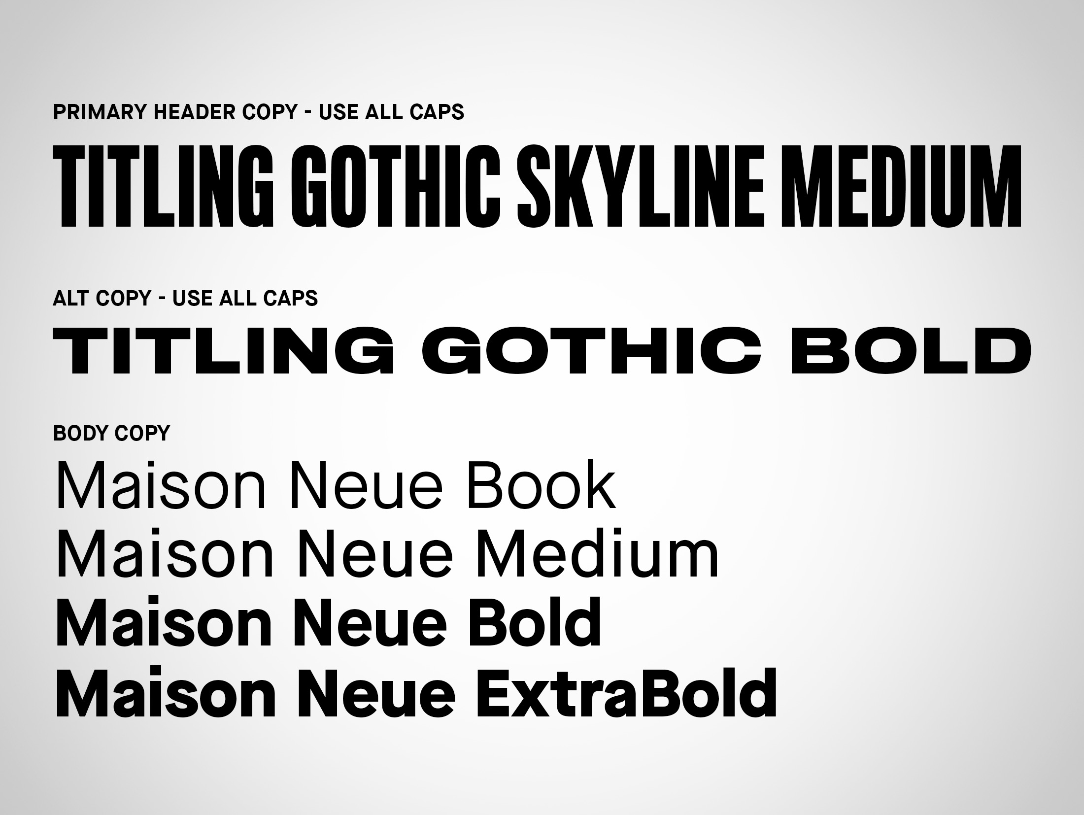
I also led the creation of the creative guide and toolkit for use by our in-house creative team, external agencies, and freelance designers in order to uphold a cohesive look across a variety of projects throughout the season.
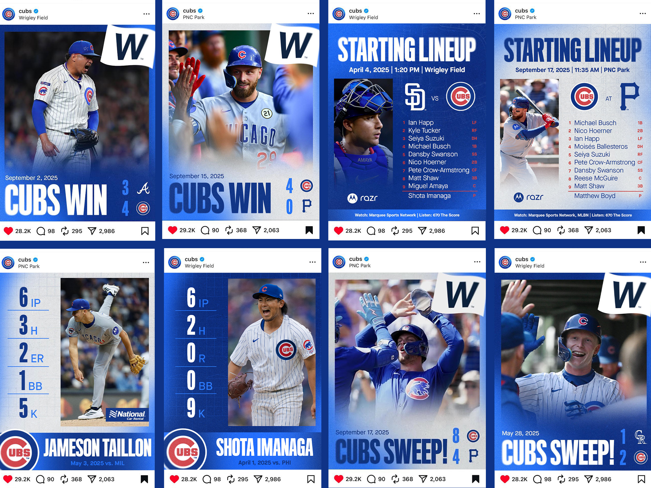
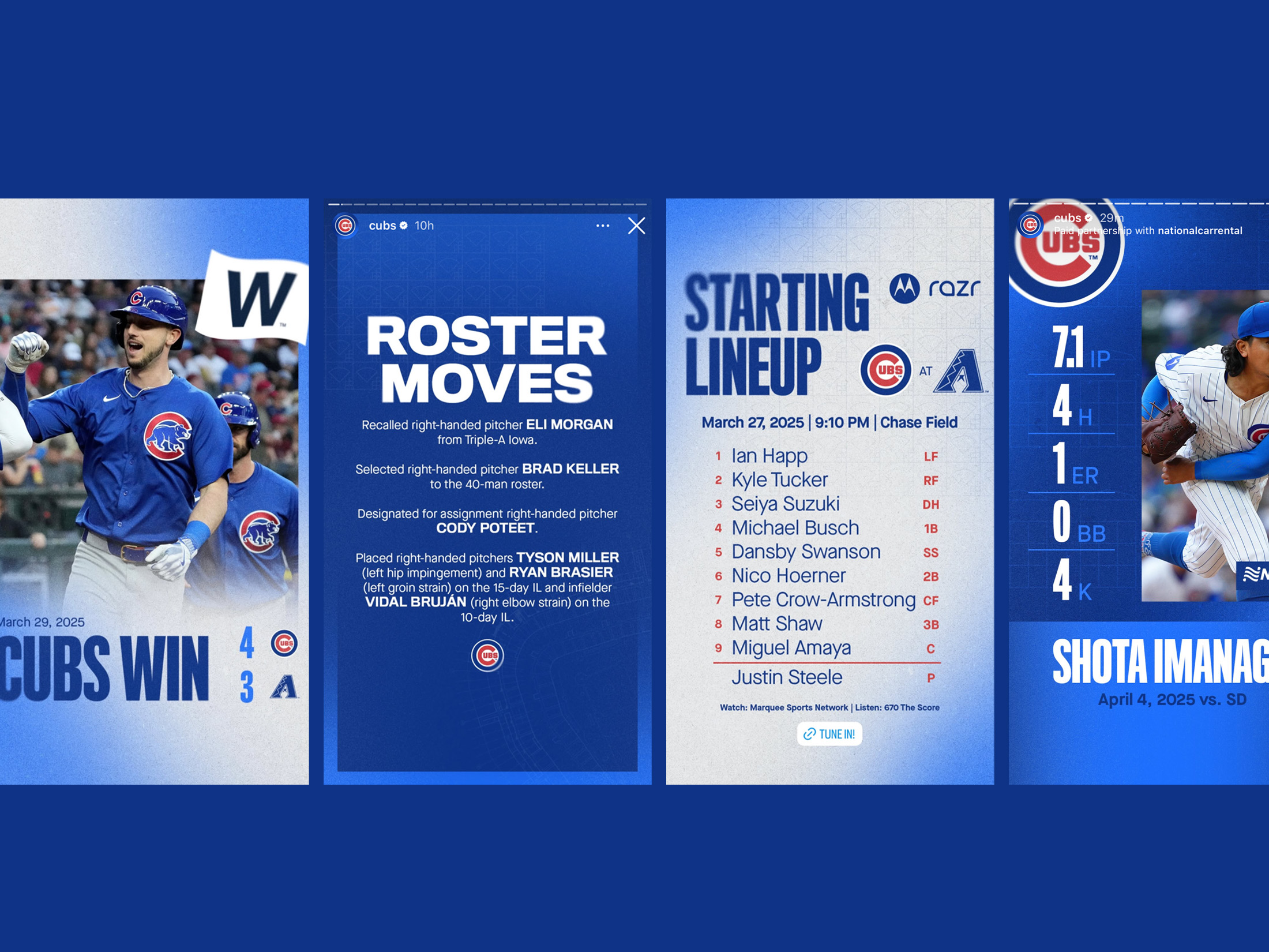
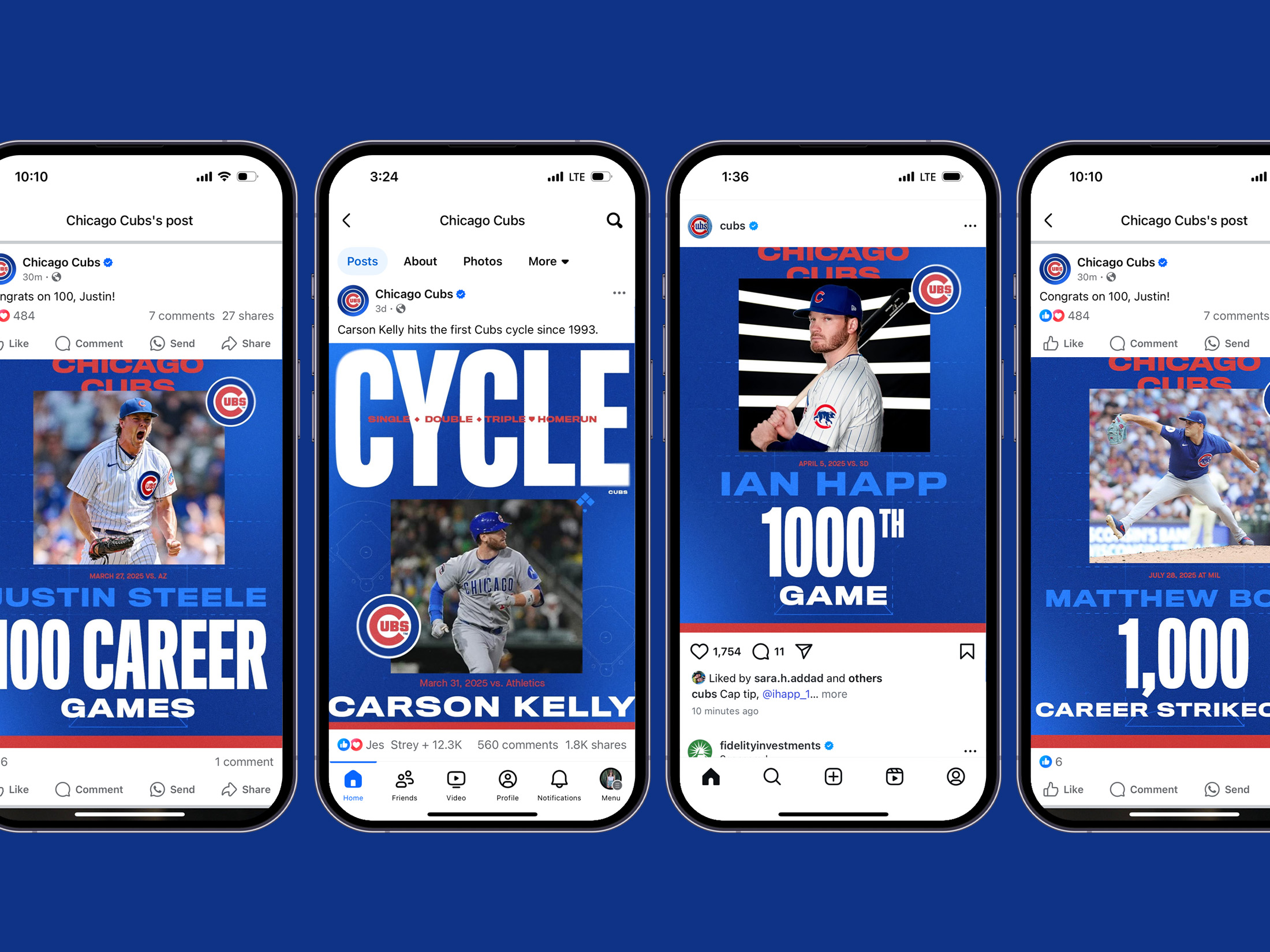
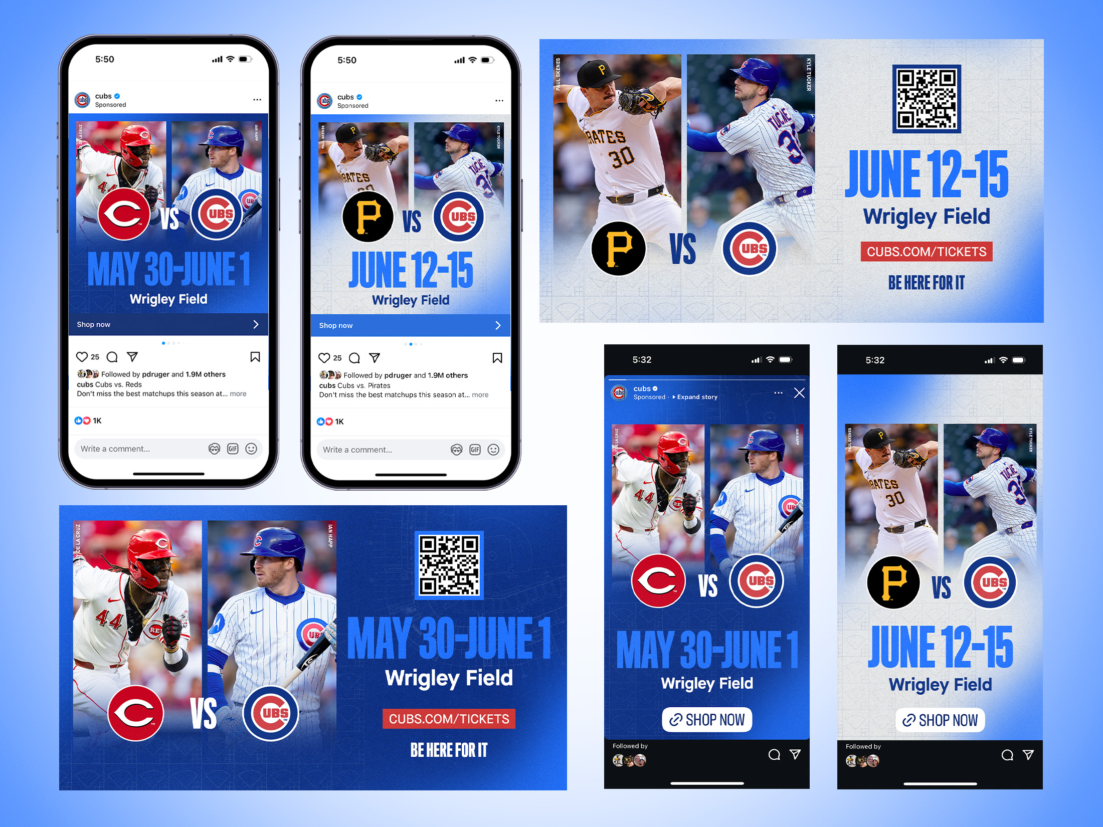
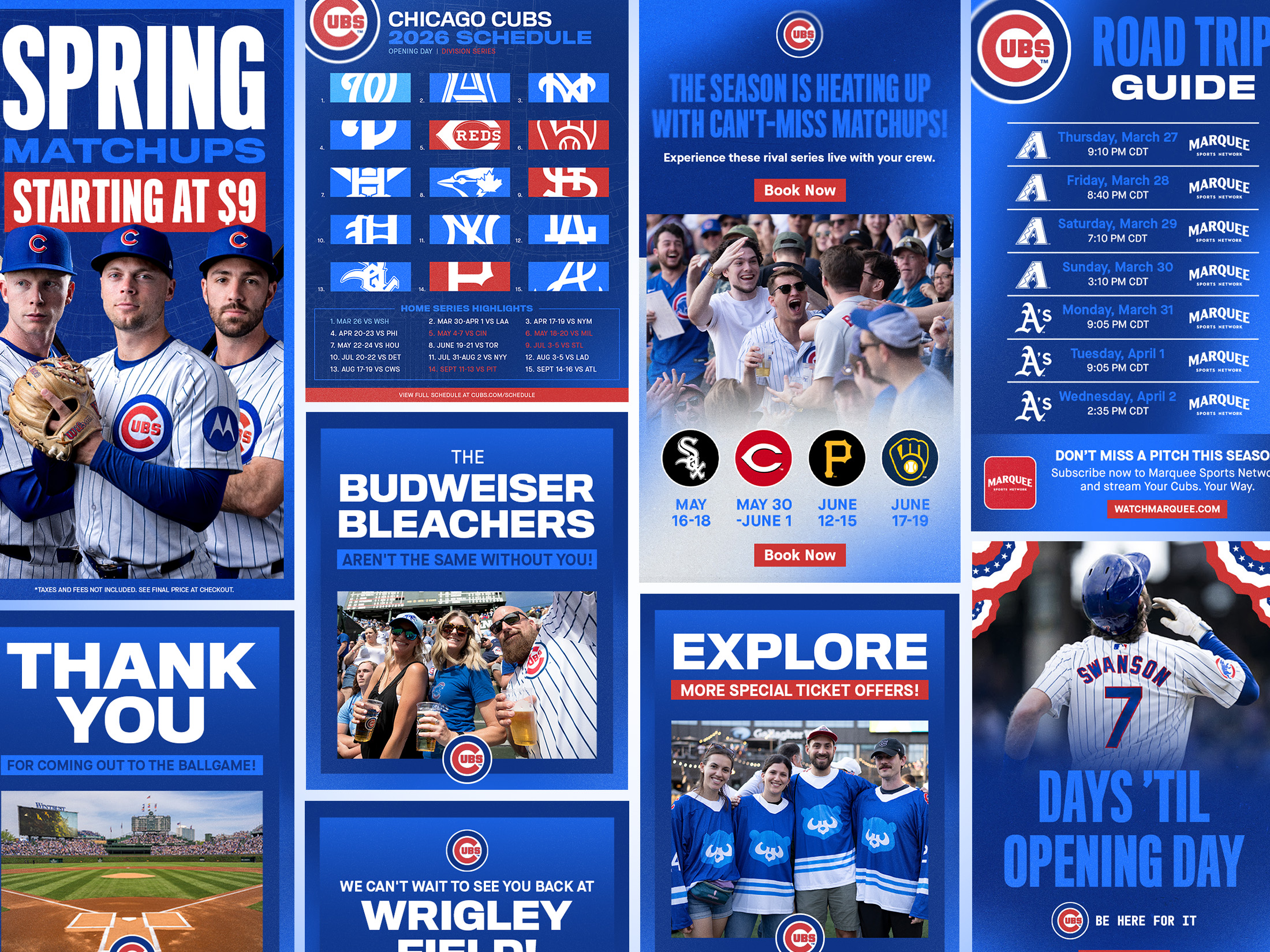
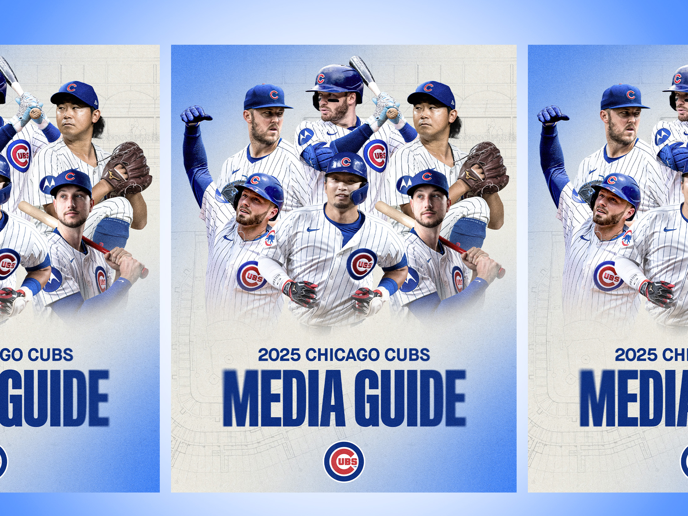
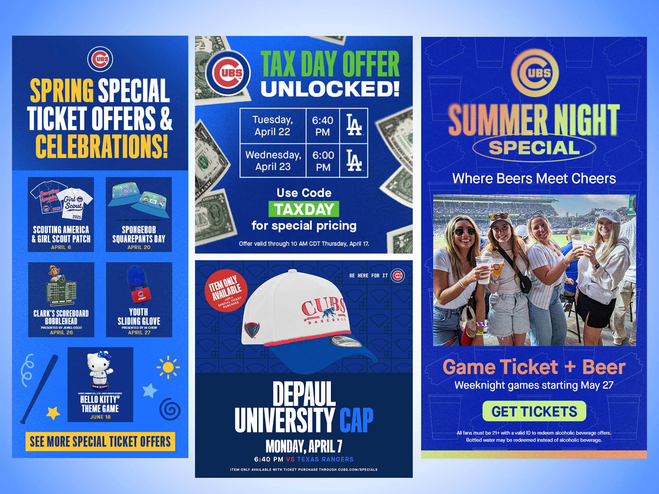
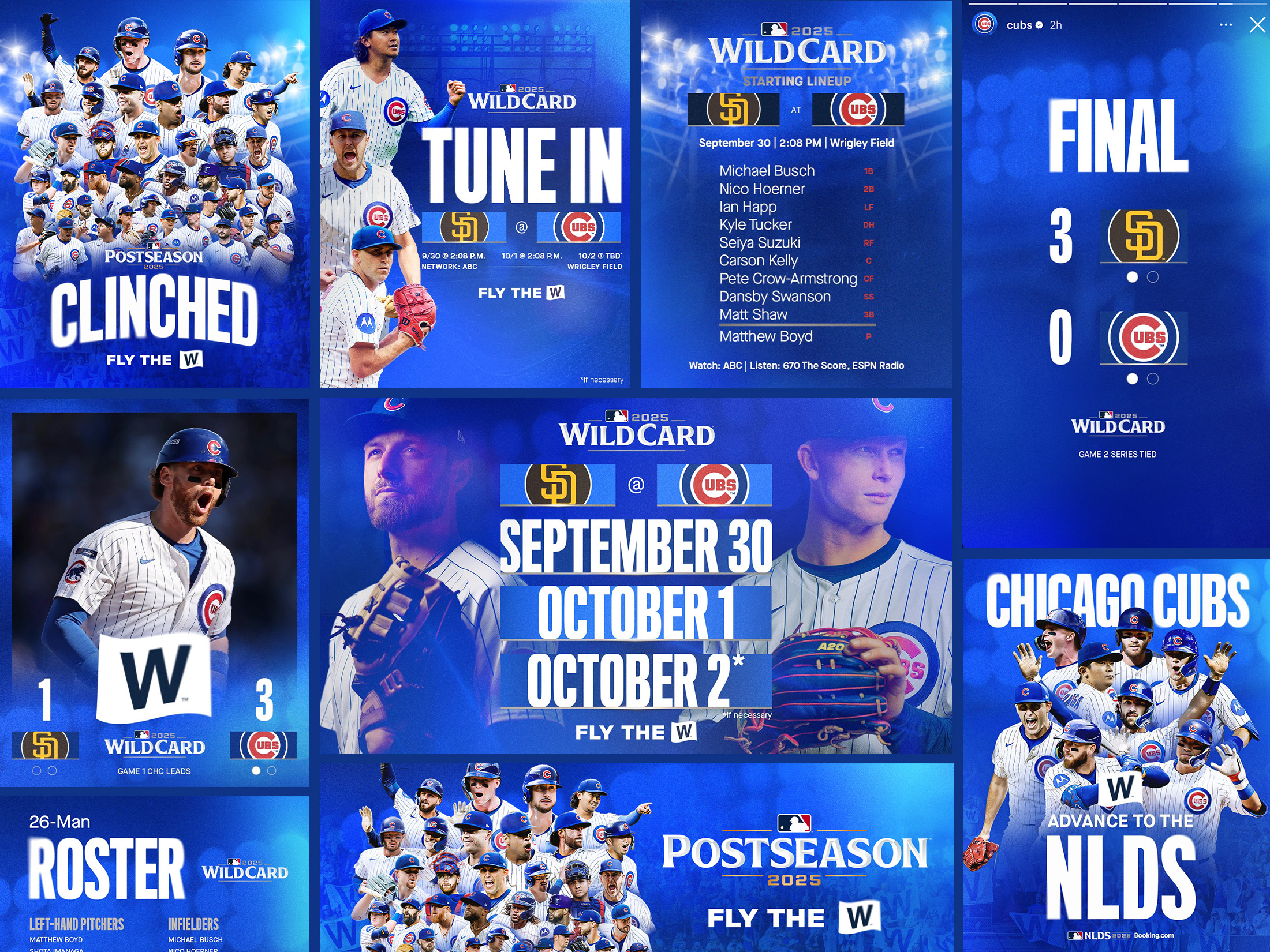
I created a majority of the templates and graphics in the overview deck below, including the game templates, player matchup ad templates, various email graphics, our Media Guide cover, Summer Night Special graphics, and Postseason graphics and templates.
The Meaning Behind the Look and Feel
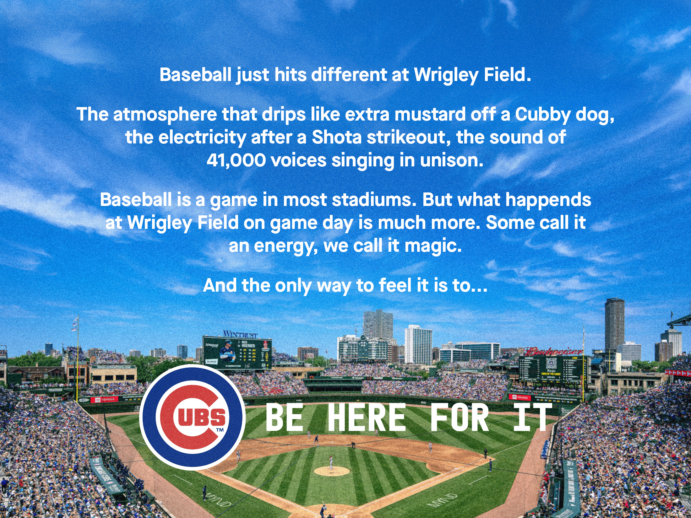
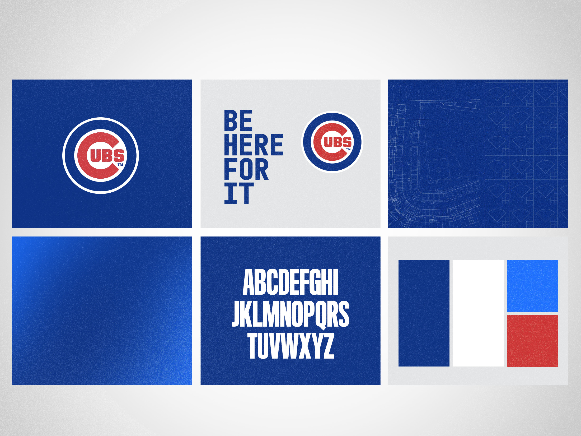
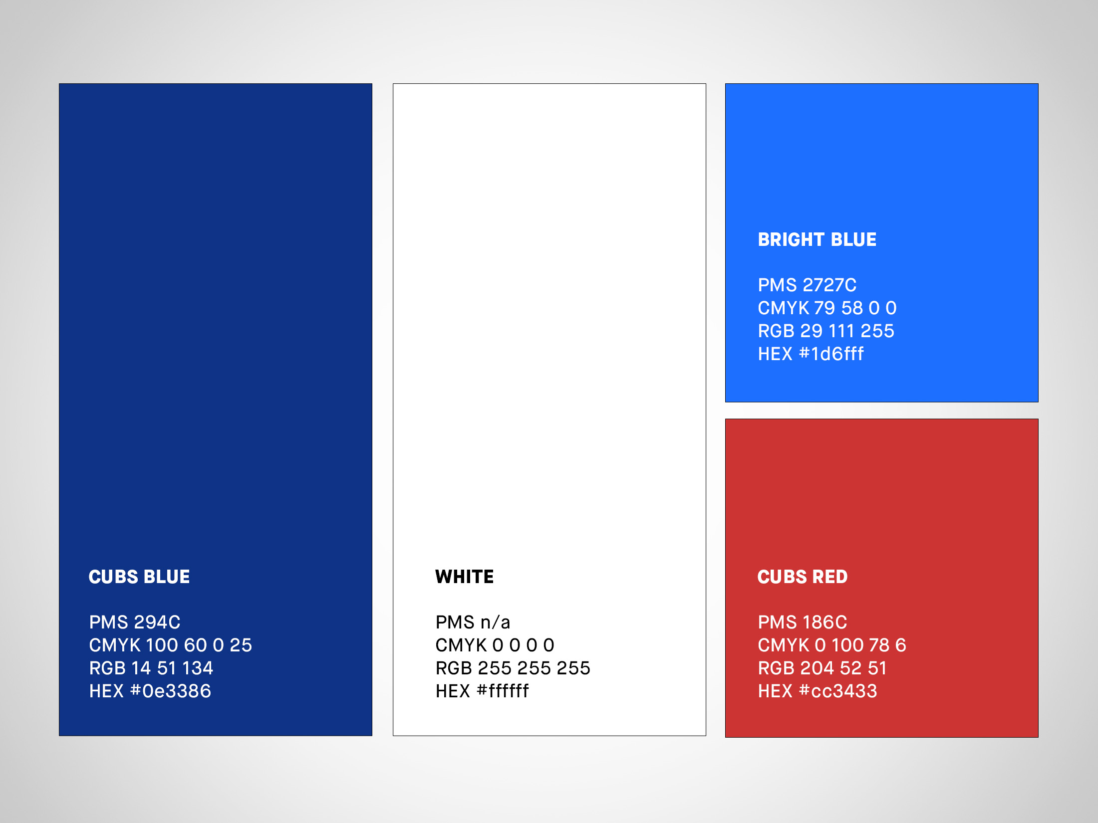
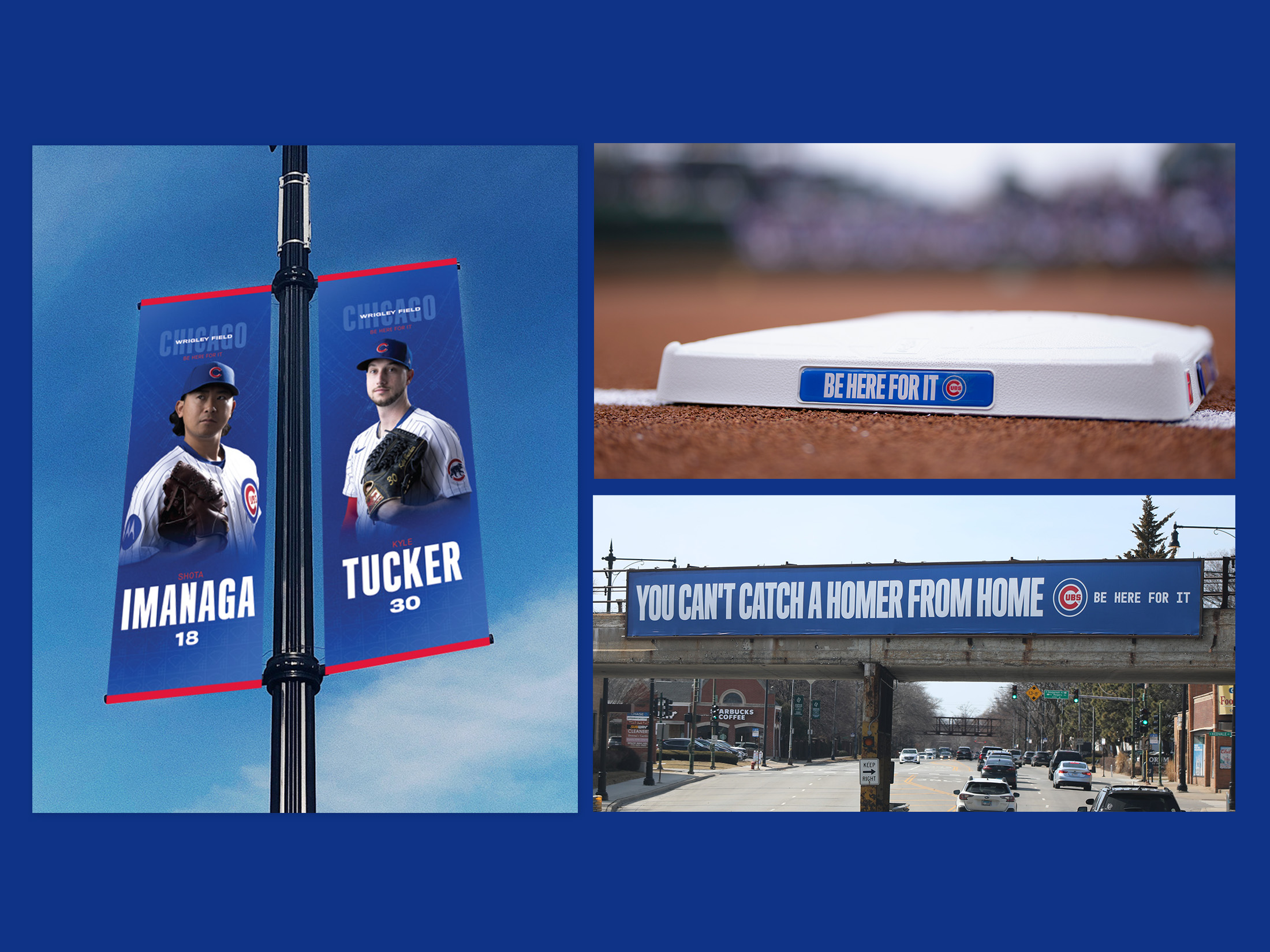
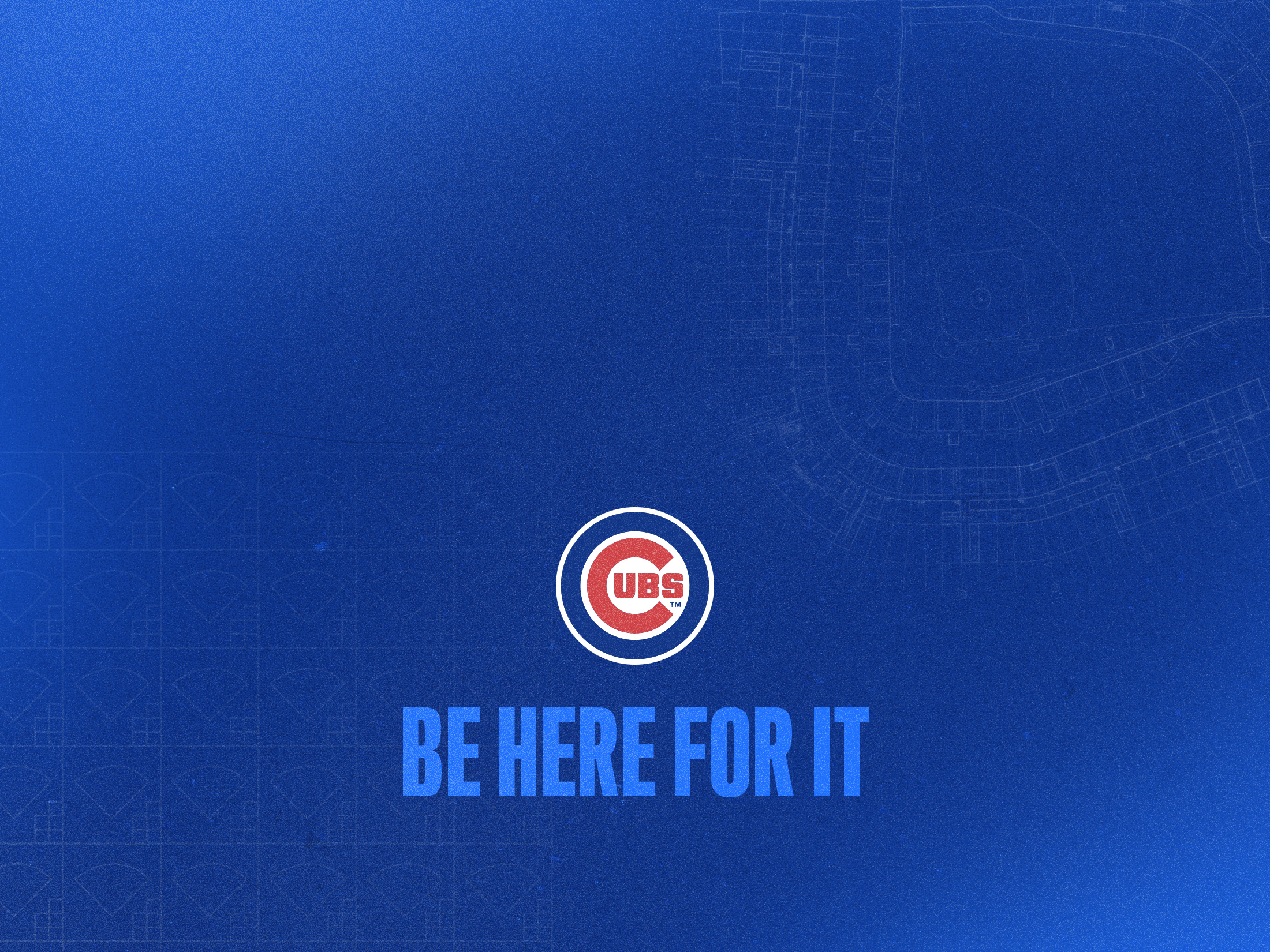
The bright blue color was brought in to evoke the excitement and energy of the campaign. Blueprints of Wrigley Field and scorecard pattern elements were created to reinforce the slogan of the campaign, “Be Here For It”, to visually represent a presence at the ballpark. Blurred text and gradients added dimension, interest, and movement, implying pausing for a moment in time — in order to really be present, be excited, and “Be Here For It”.
Overview Deck